Apple
Art Direction, Packaging, Branding
2022–2023
Available upon request.
No Magic in Riso
Publishing, Print, Riso
2018
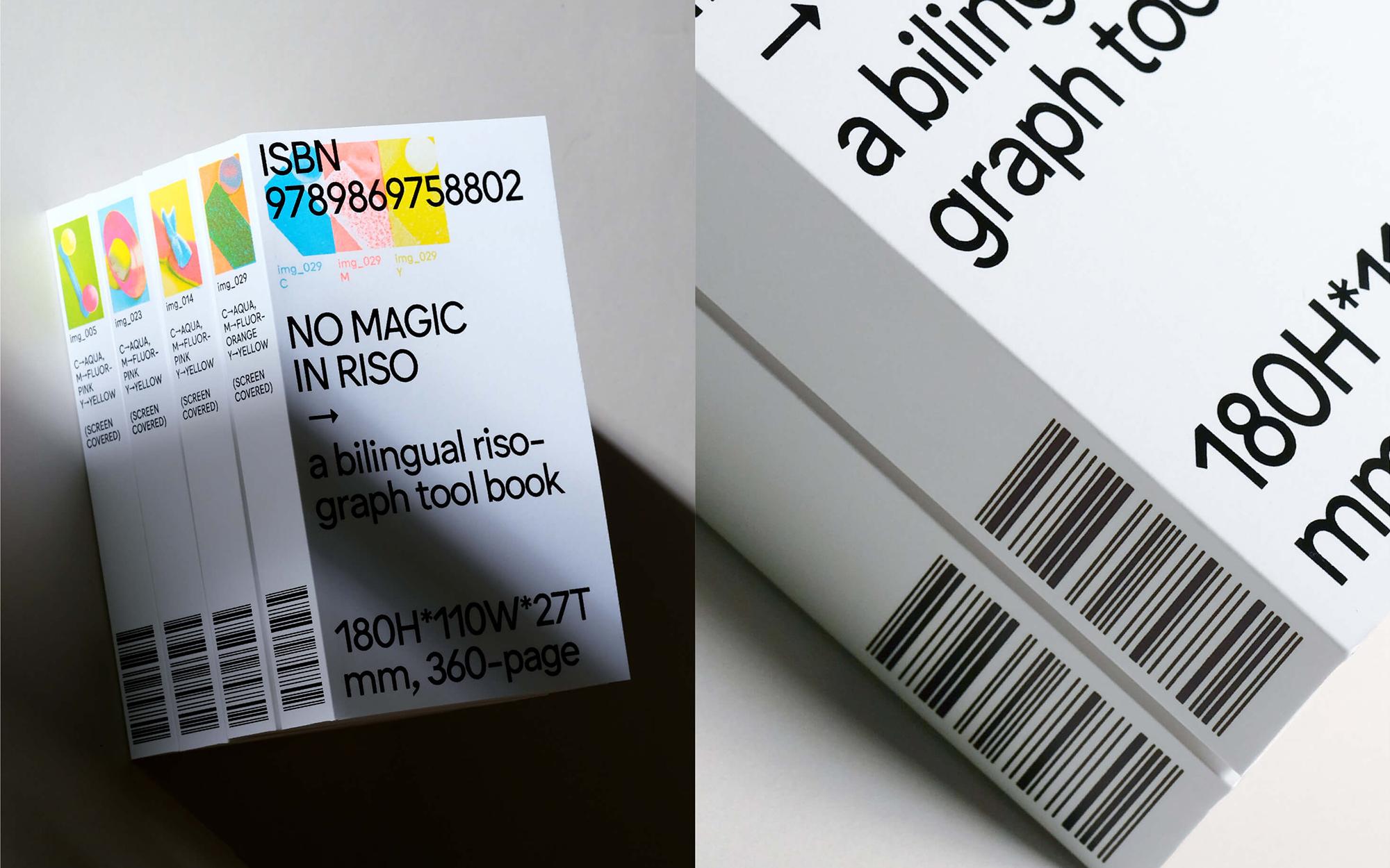
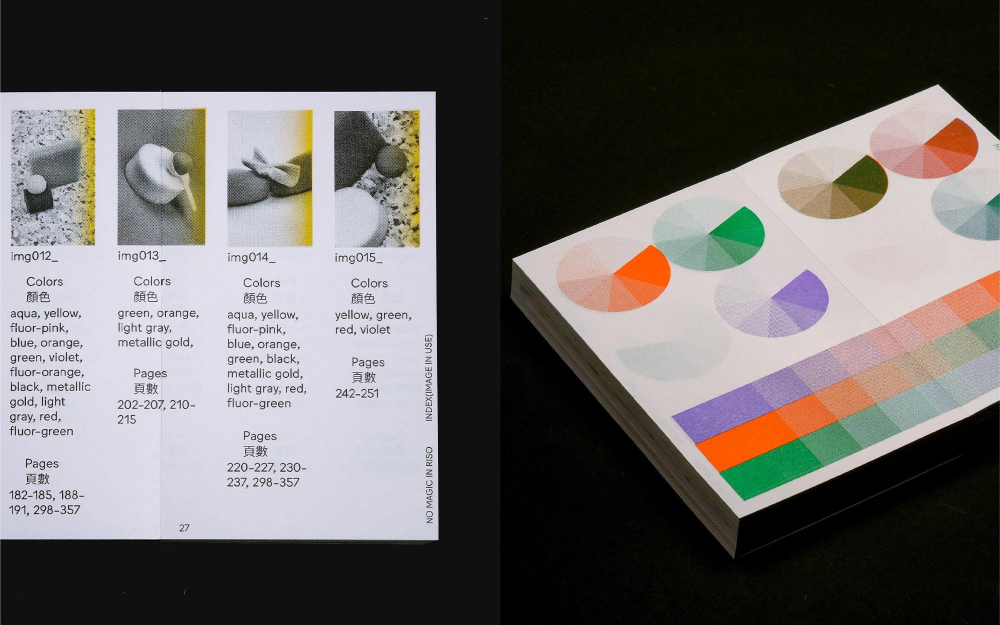
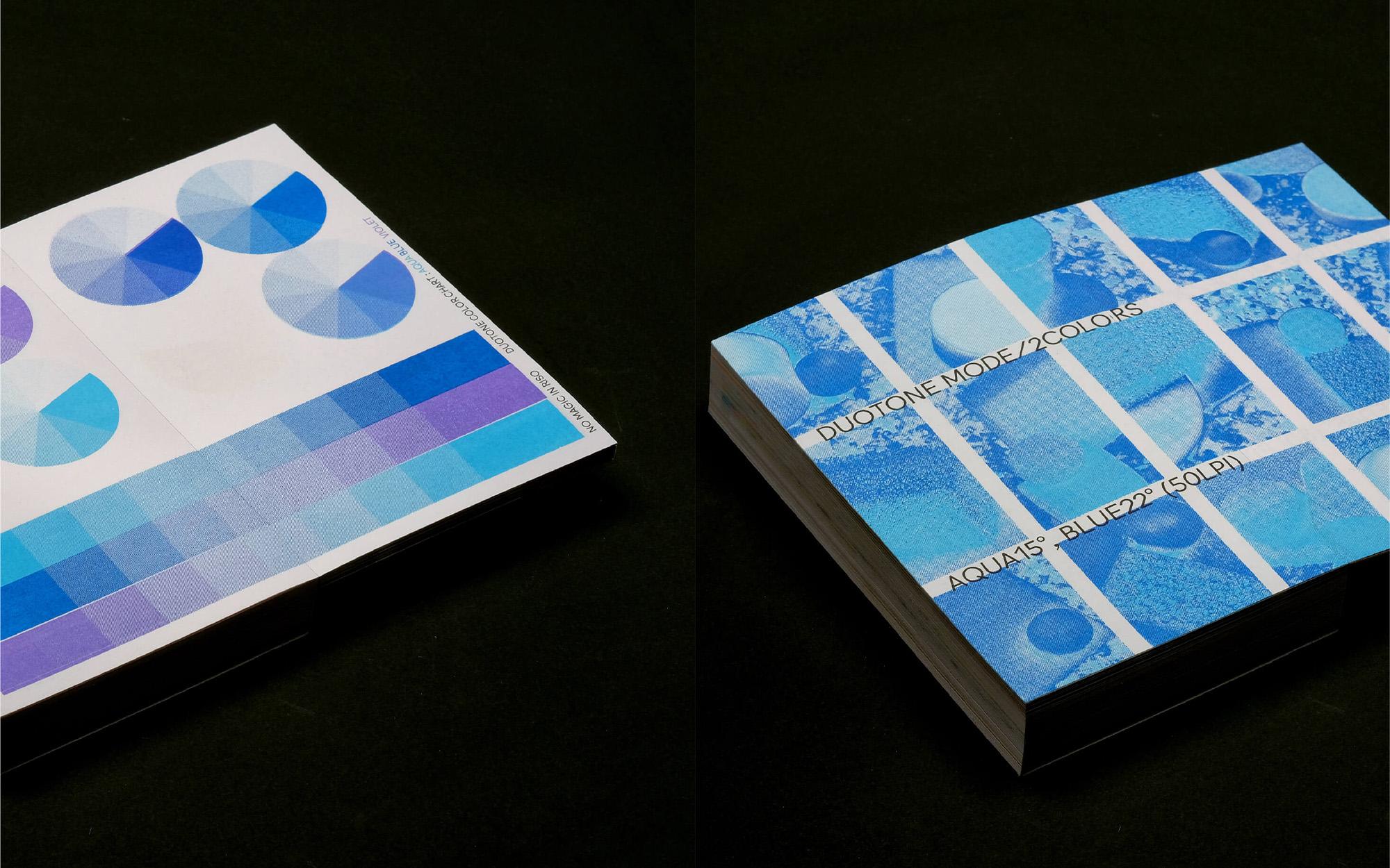
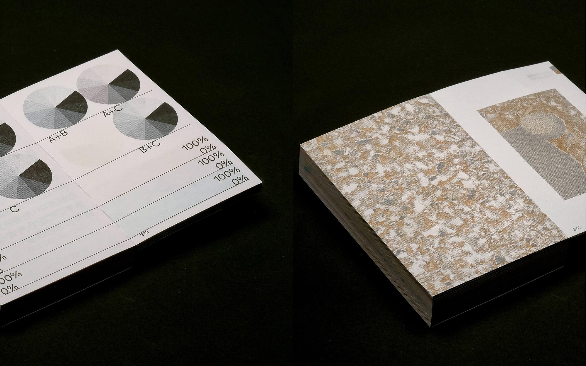
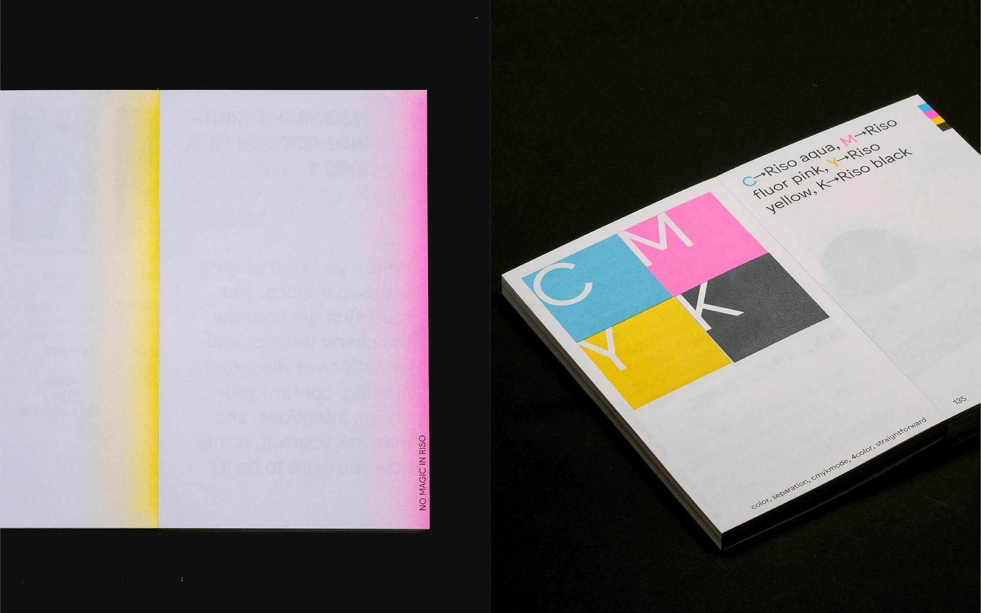
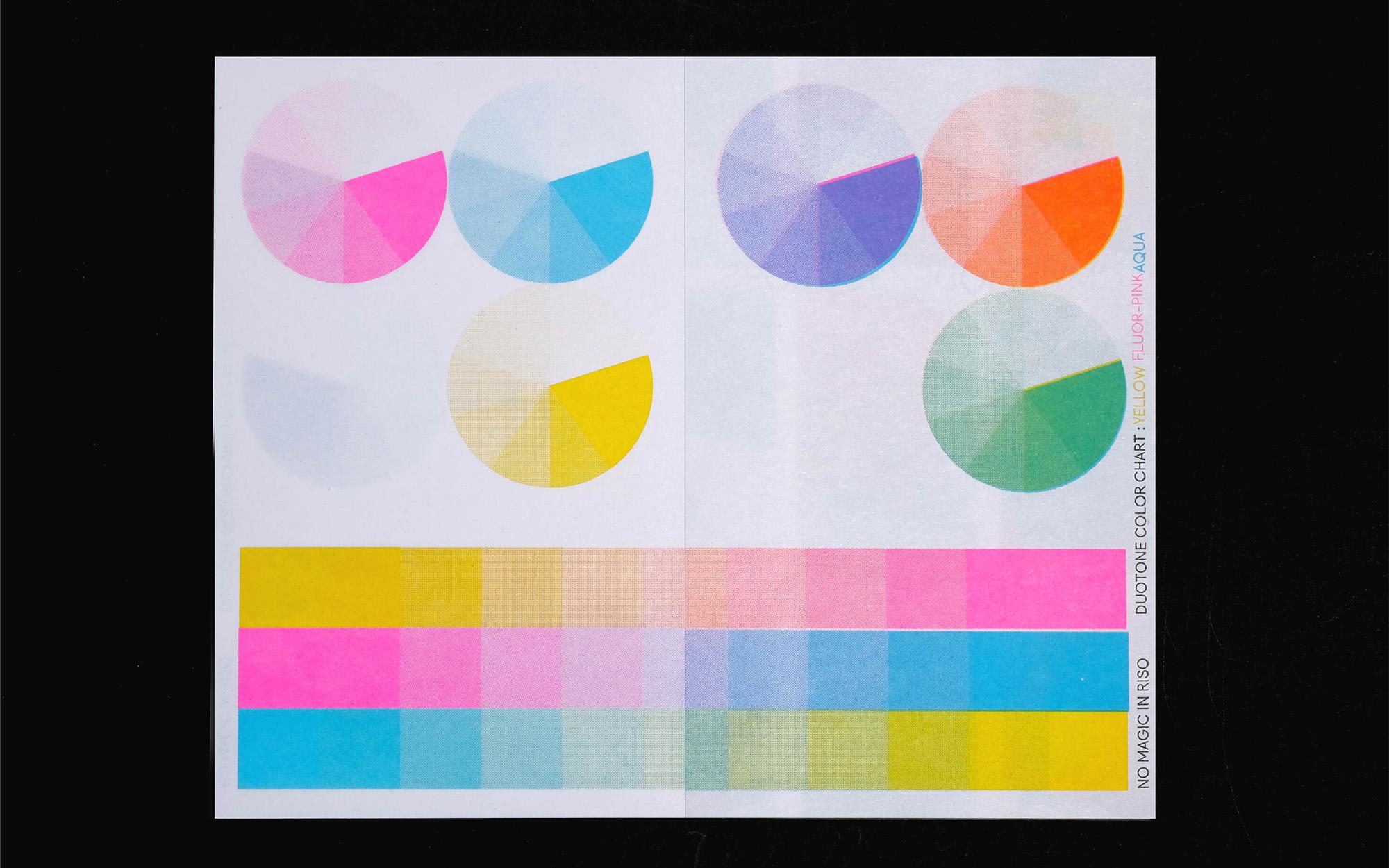
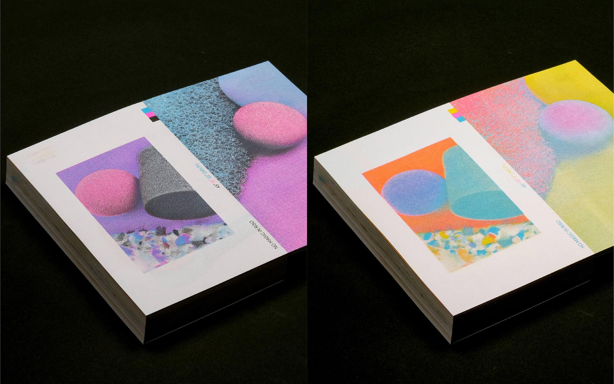
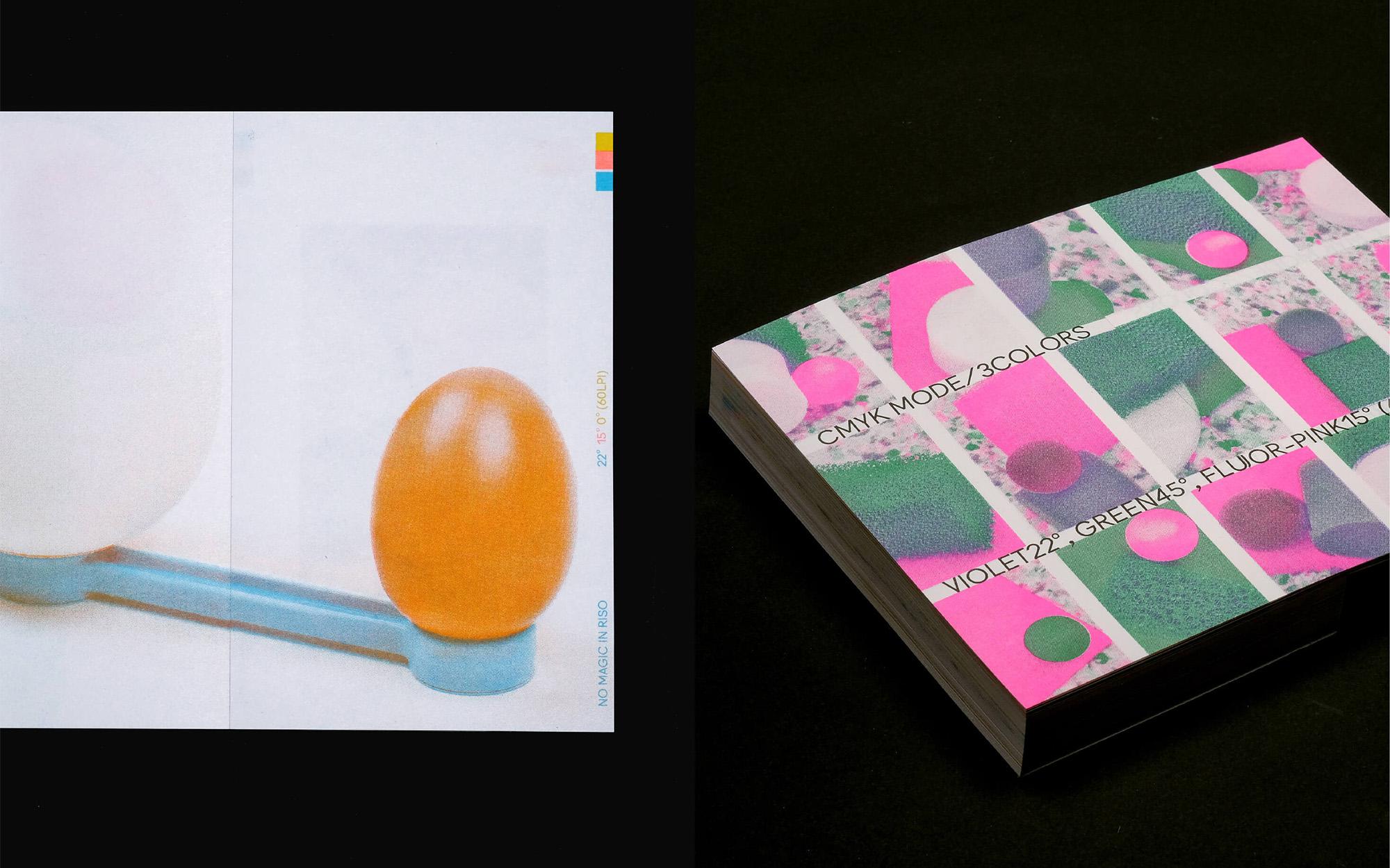
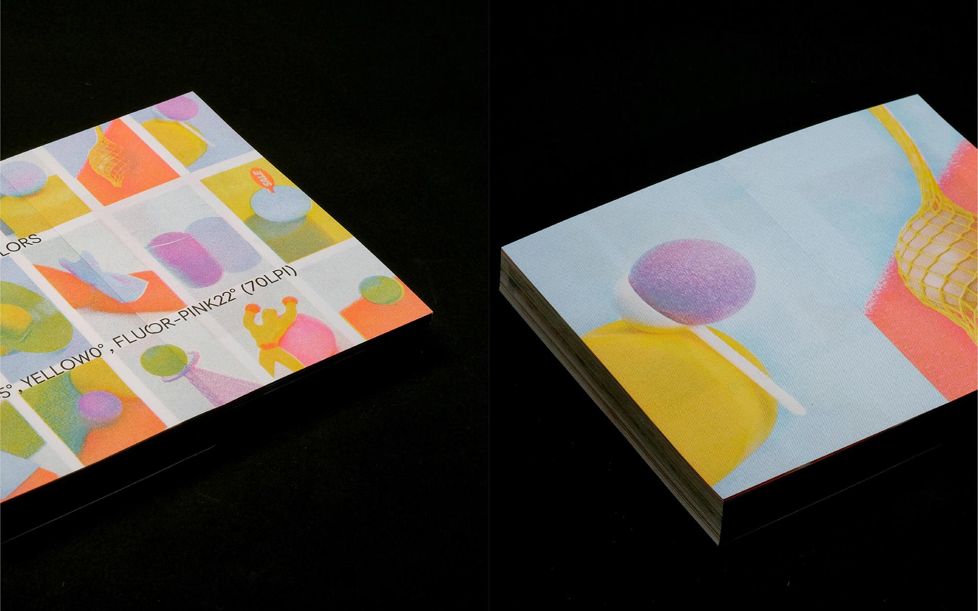
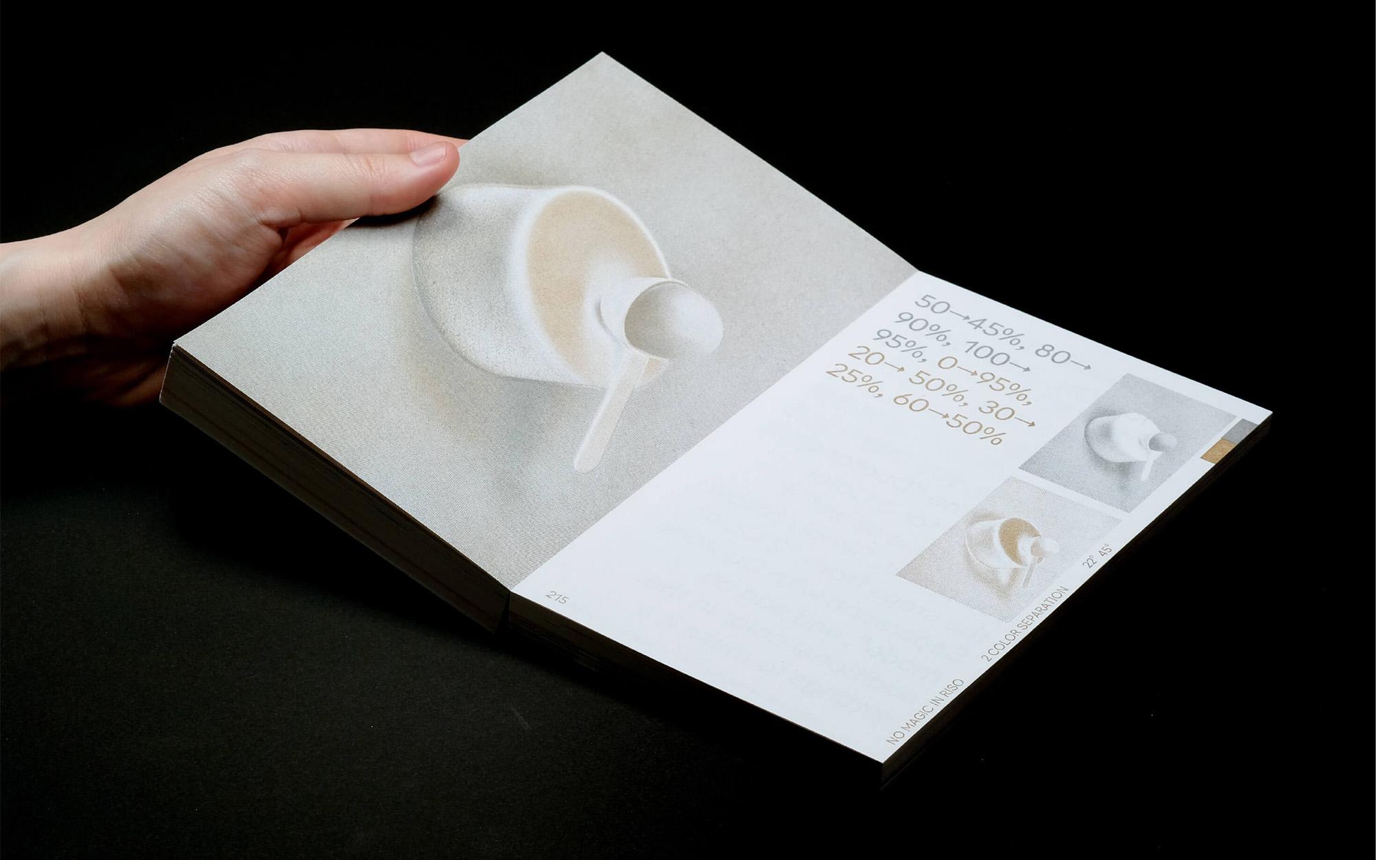
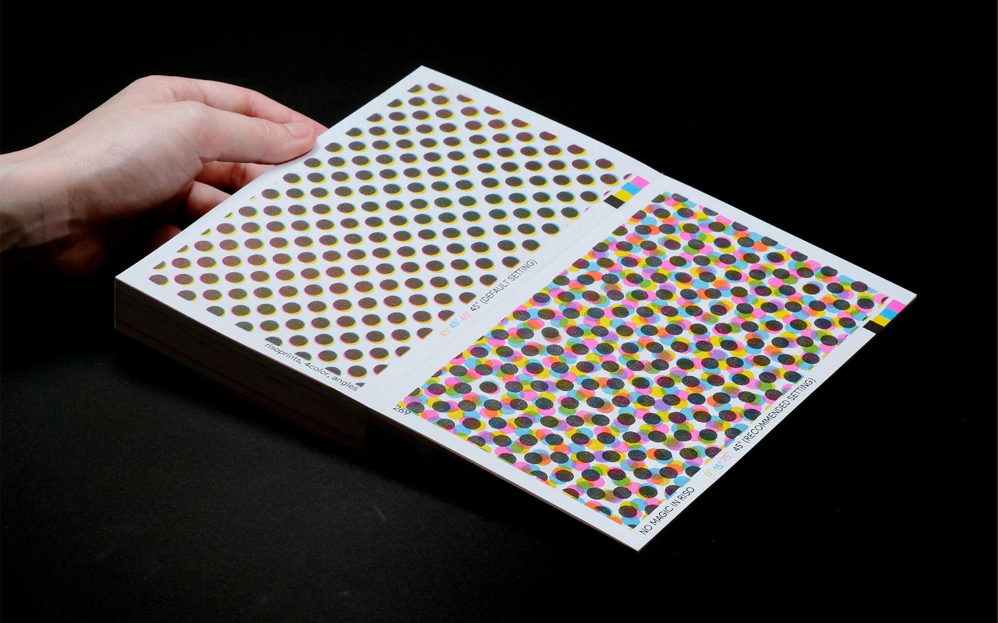
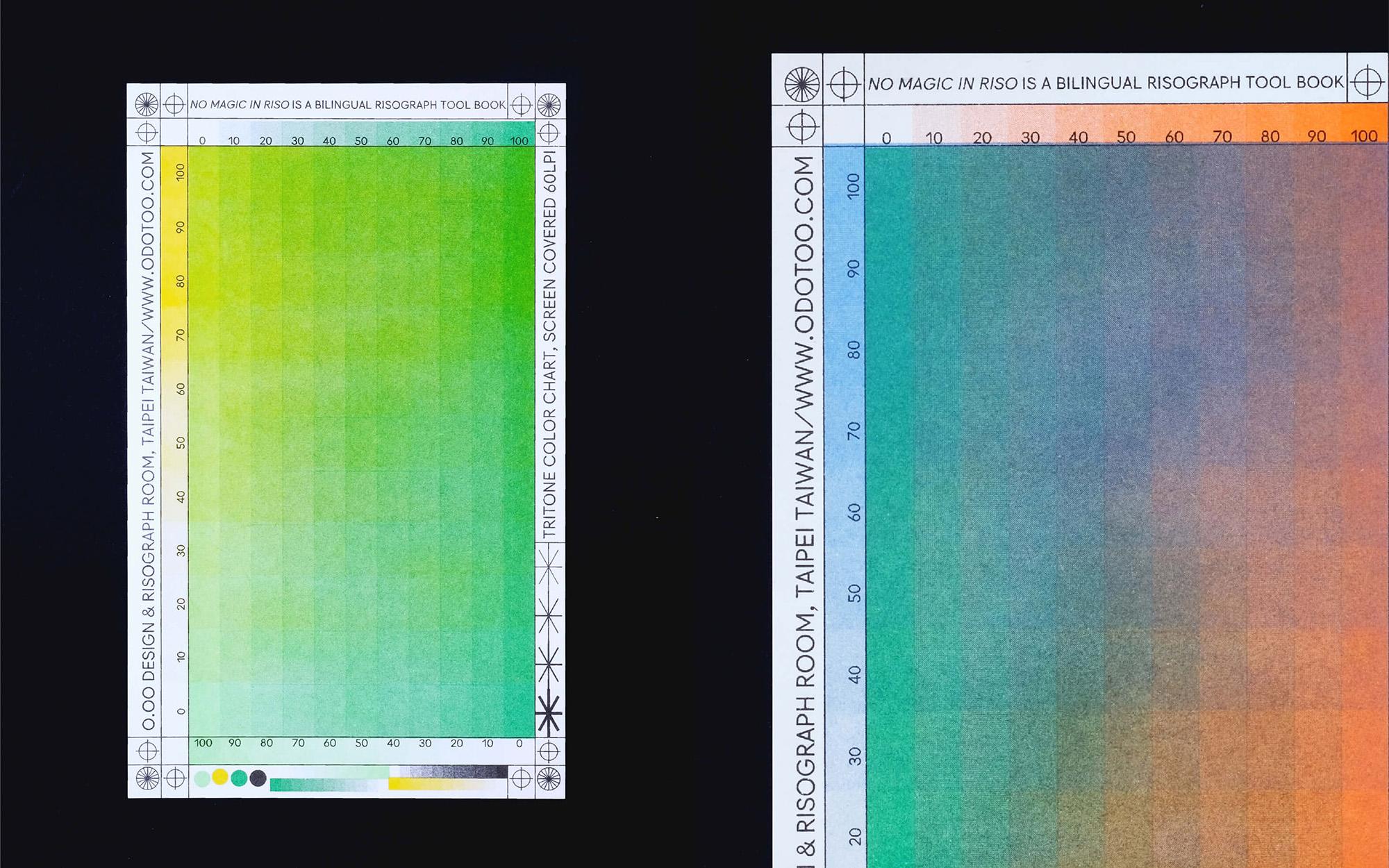
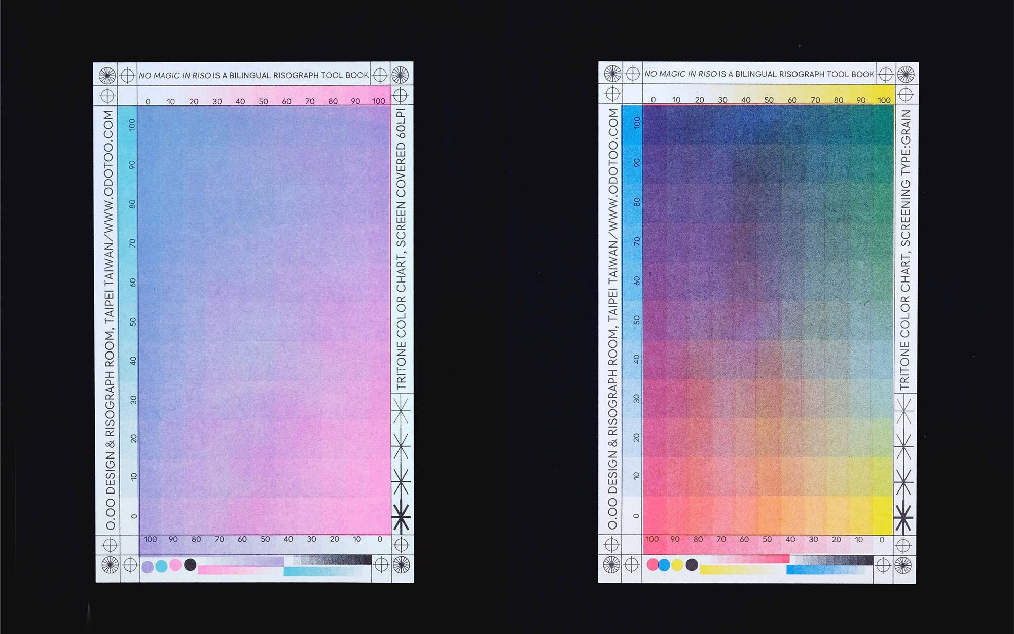
NO MAGIC IN RISO is a bi-lingual Risograph toolbook written in English and Chinese. The process took 850 days, 74 tubes of soy ink, 15 colors, 660 masters, 690,000 sheets of paper, 3 fans, 2 riso printers, and 4 people to complete this 360-page book.
NO MAGIC IN RISO is the result of 2 years of image separation studies and experiments, and is the second book published by O.OO. Instead of using wordy descriptions, we hope that readers can feel the wonders of Risograph printing through the details of the design in the book. Whether you are a designer, an artist, or an illustrator, anyone interested in color can use this book to enter the field with ease.
Featured in ︎︎︎It’s Nice That, ︎︎︎A Book on Books, ︎︎︎Communication Arts, amongst others.
︎ Role: (Co-)Author, (Co-)Art Direction
︎ created at: O.OO
Kirin Cup Tournament
Visual Direction, Design
2021

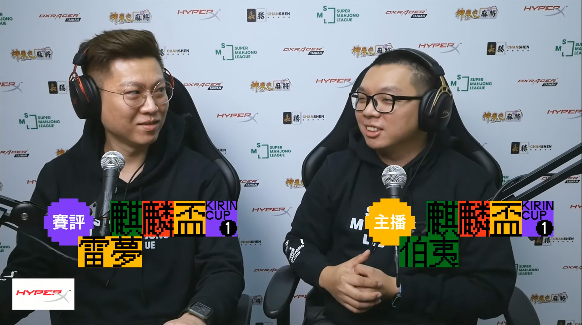

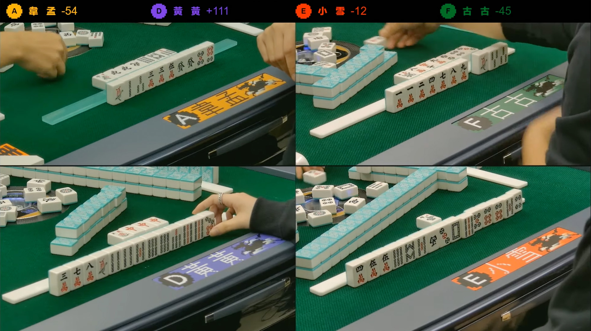
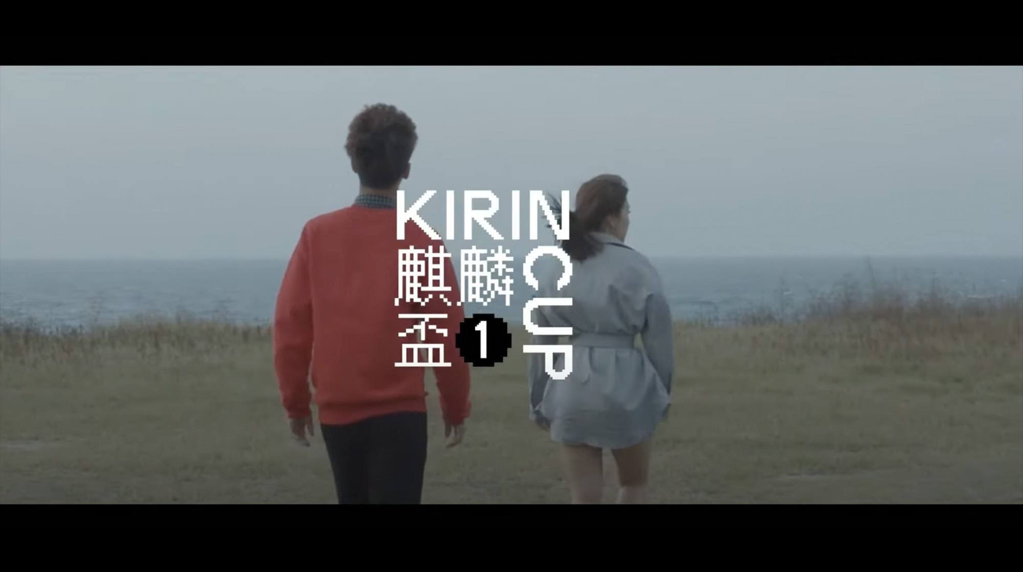
The Kirin Cup is the first Mahjong Tournament held by the Super Mahjong League in Taipei, Taiwan. Streamed on Youtube and backed by the online gaming community, I wanted to work with visual directions that sectored away from old, traditional ideas of Mahjong and into a newer and fresher take on the popular game. The resulting visual direction is inspired by retro gaming and vibrant colours associated with gaming culture, catering to the young adult viewers and players of the tournament. This was then iterated onto assets such as on-screen labels and on-site placards.
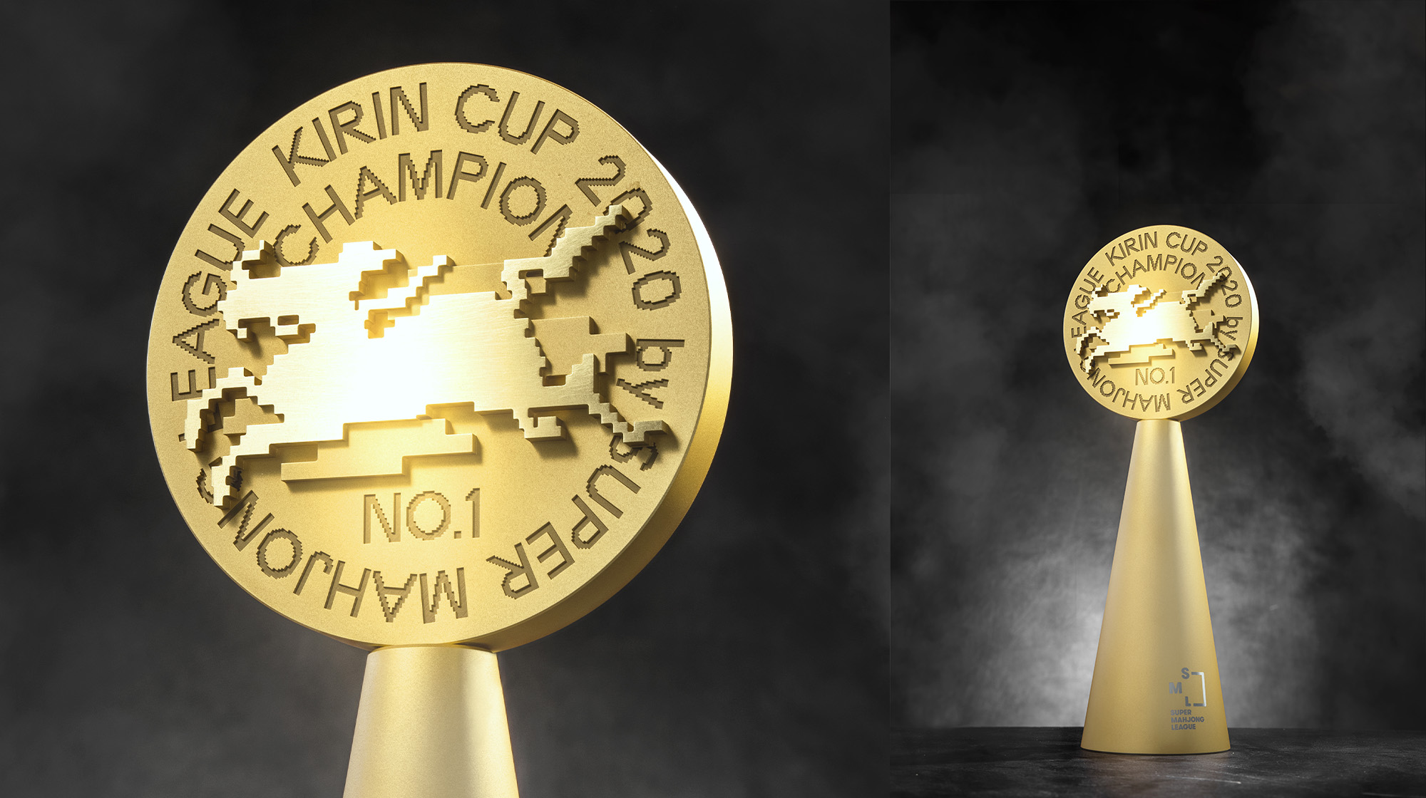
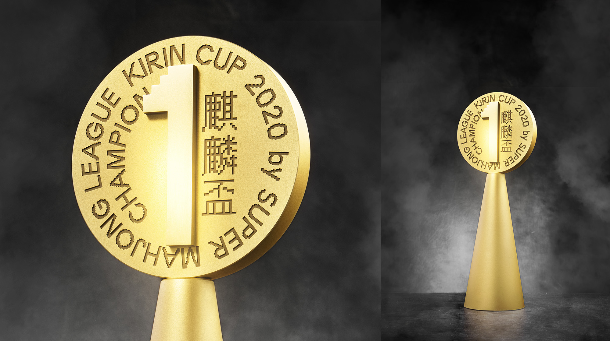
The Kirin Cup trophy features the an 8-bit version of mythical creature the tournament is named after, leaping over clouds.
The Kirin Cup trophy features the an 8-bit version of mythical creature the tournament is named after, leaping over clouds.
︎ Role: (Co-)Art Direction, Graphic Design (Jr.)
︎ Client: Super Mahjong League
︎ created at: O.OO
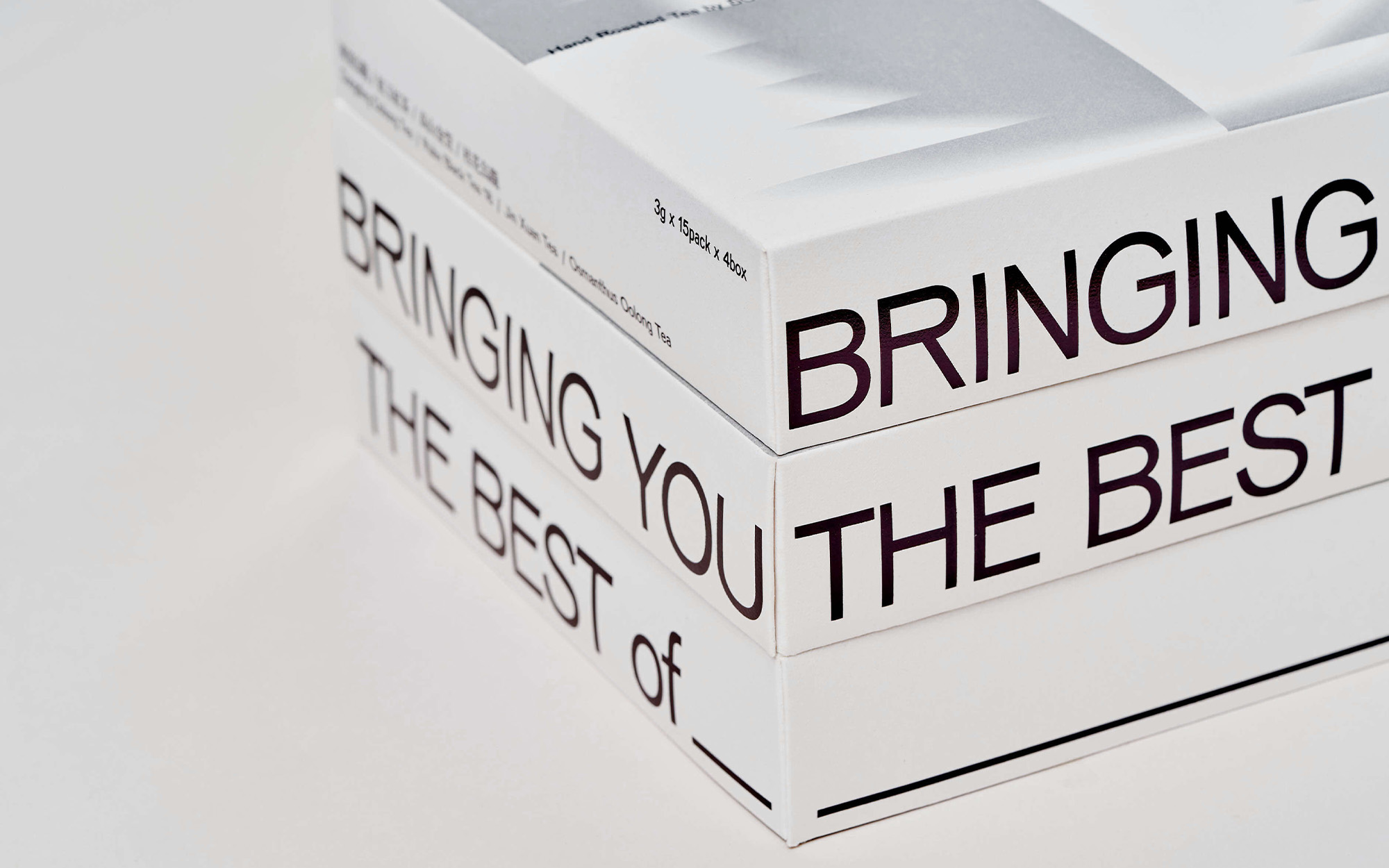
Buddha Tea House Gift Box
Packaging, Riso, Print
2020
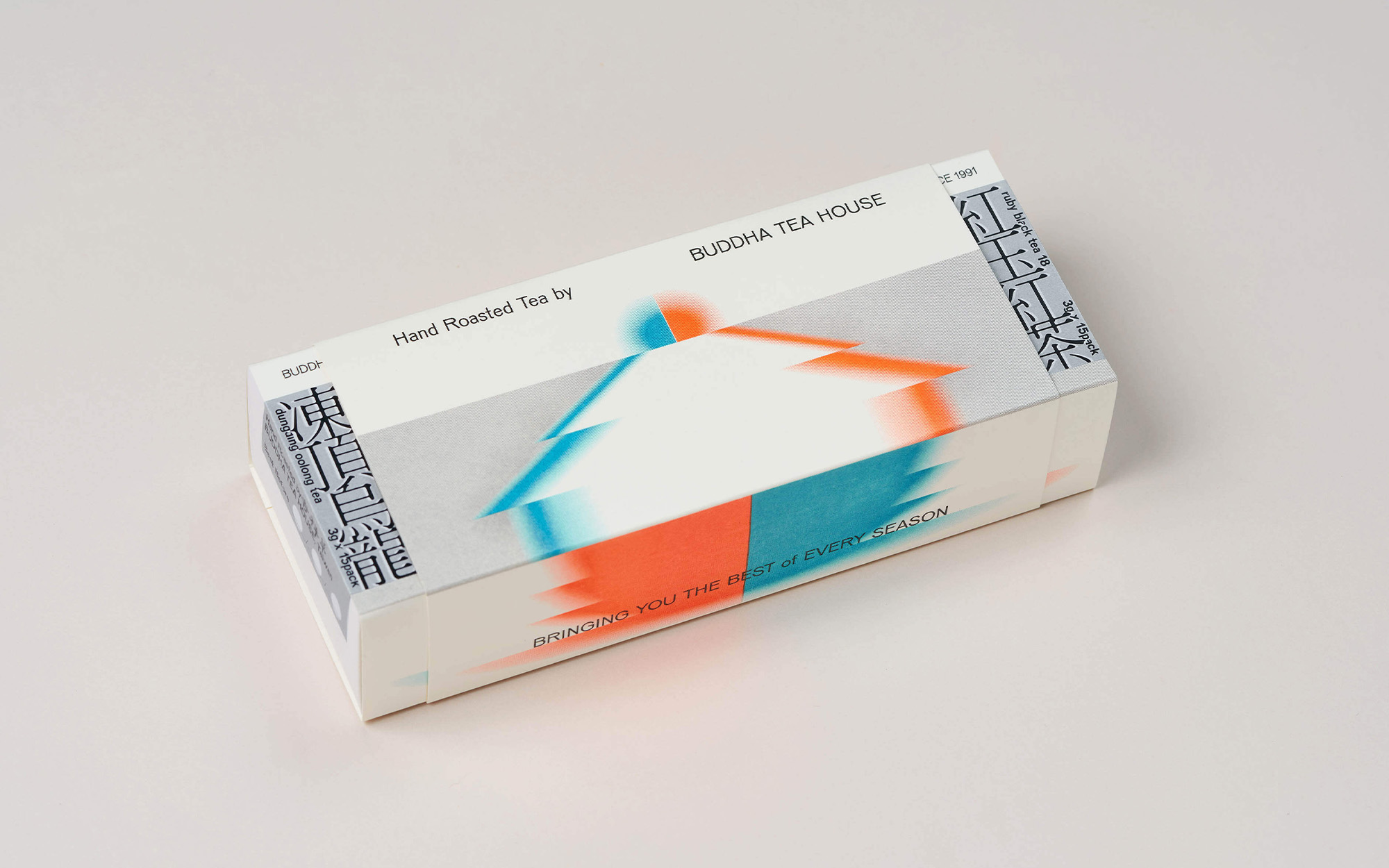


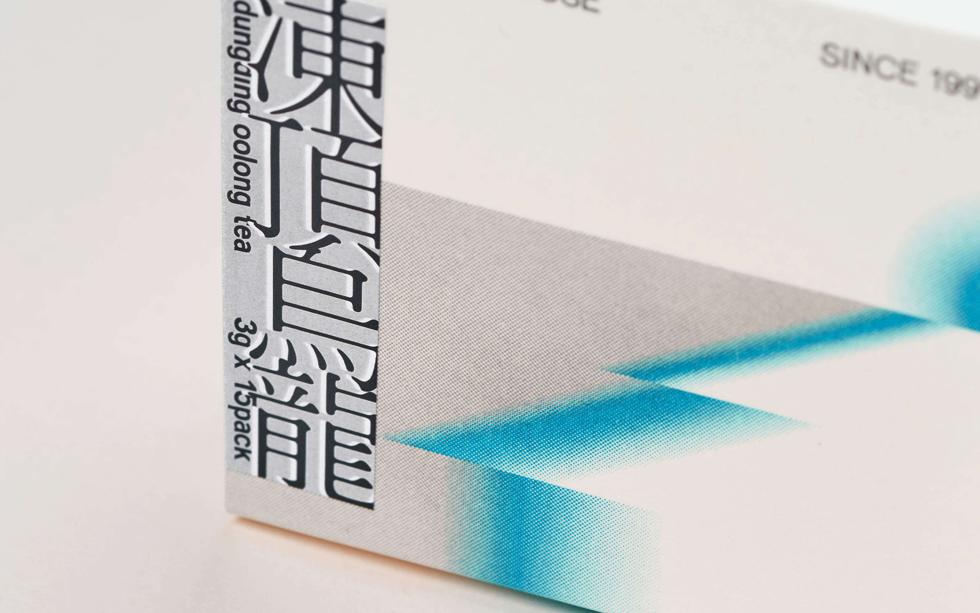
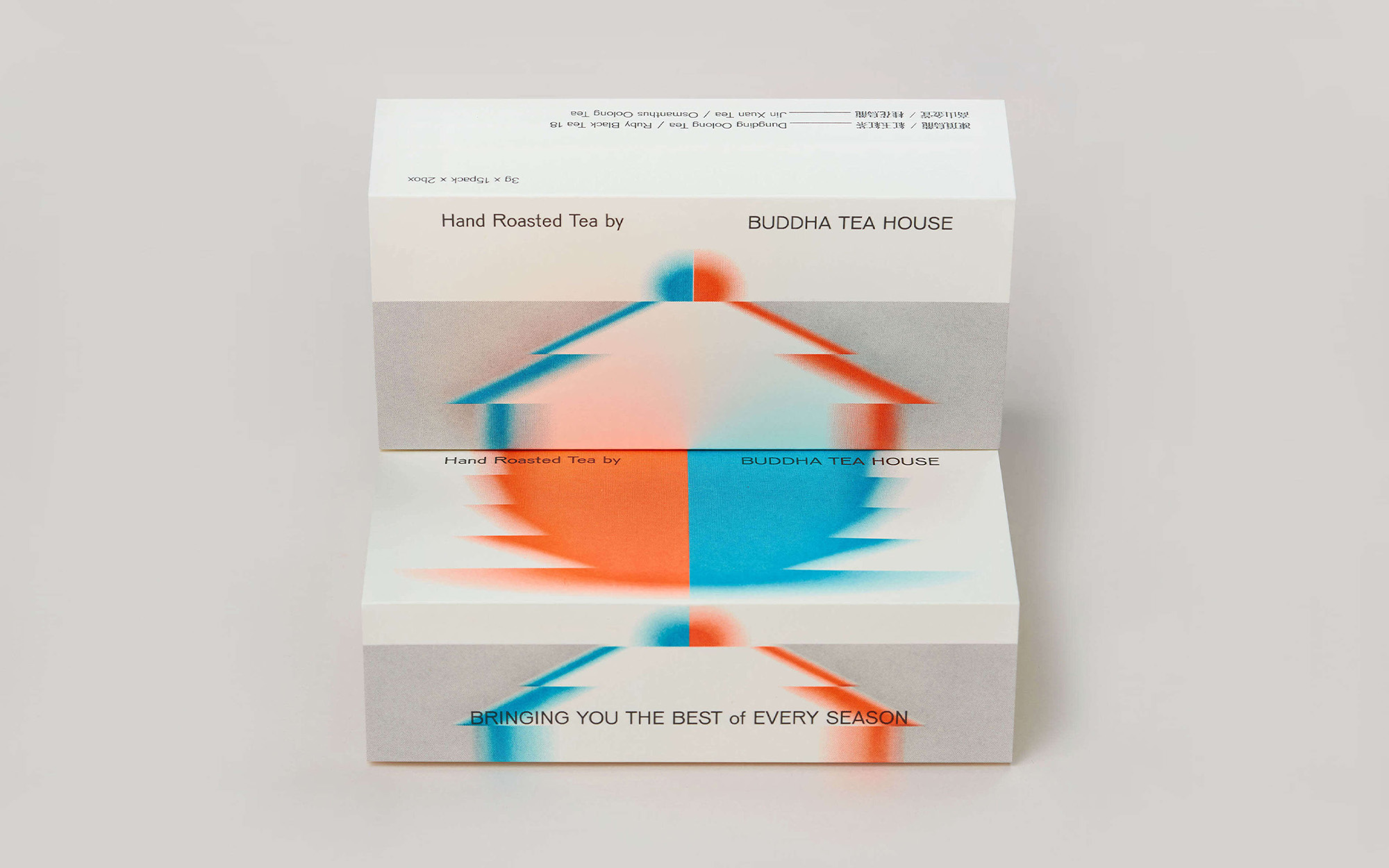
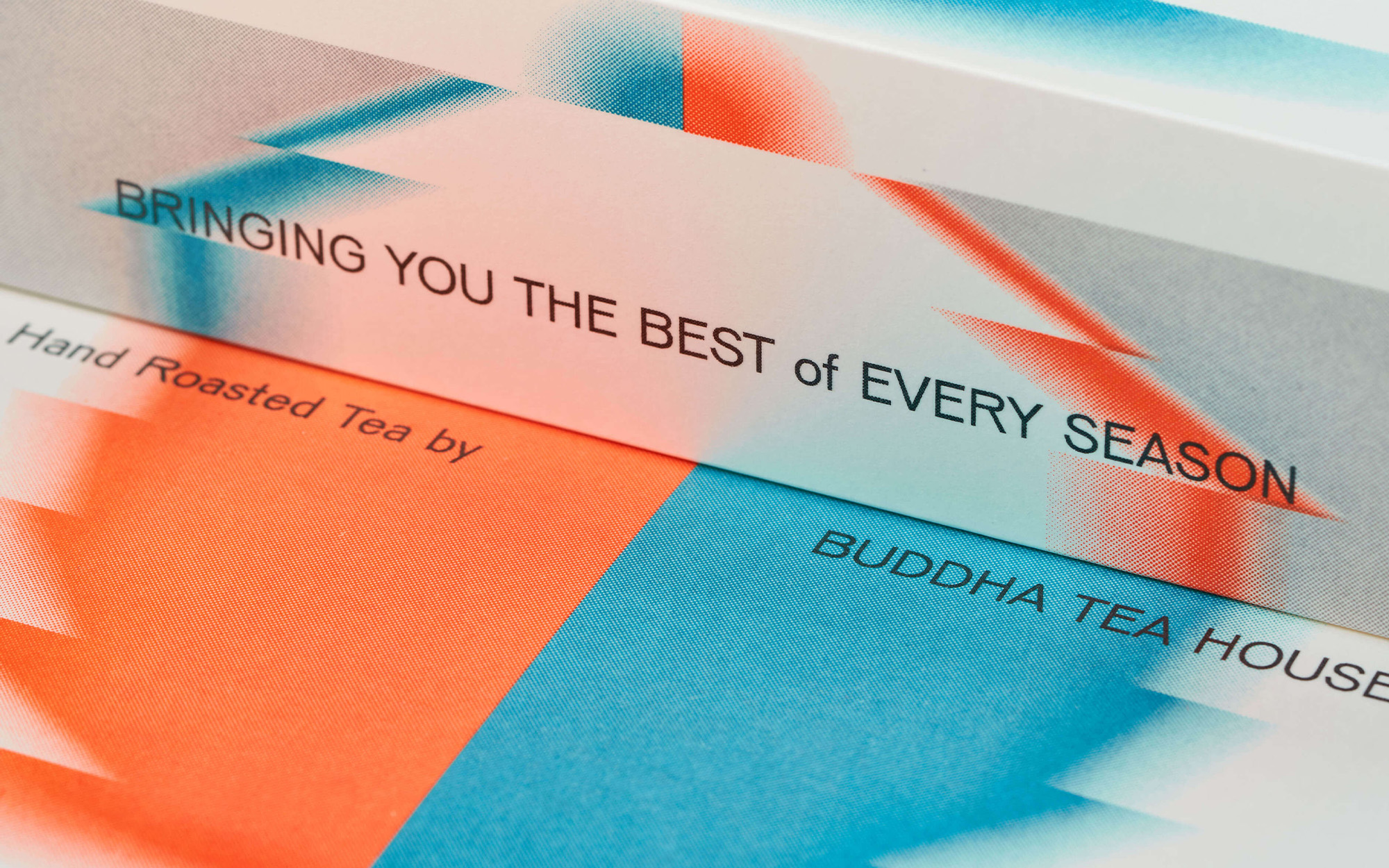
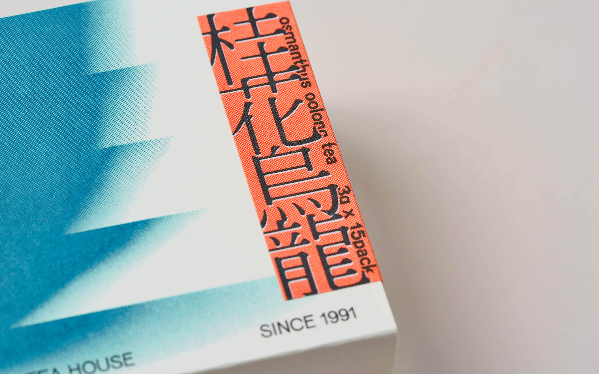
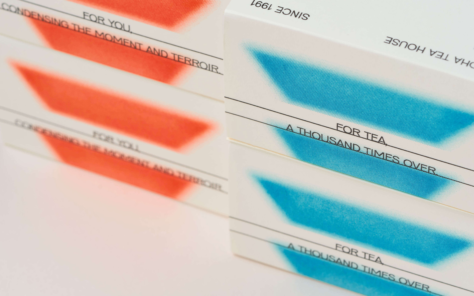
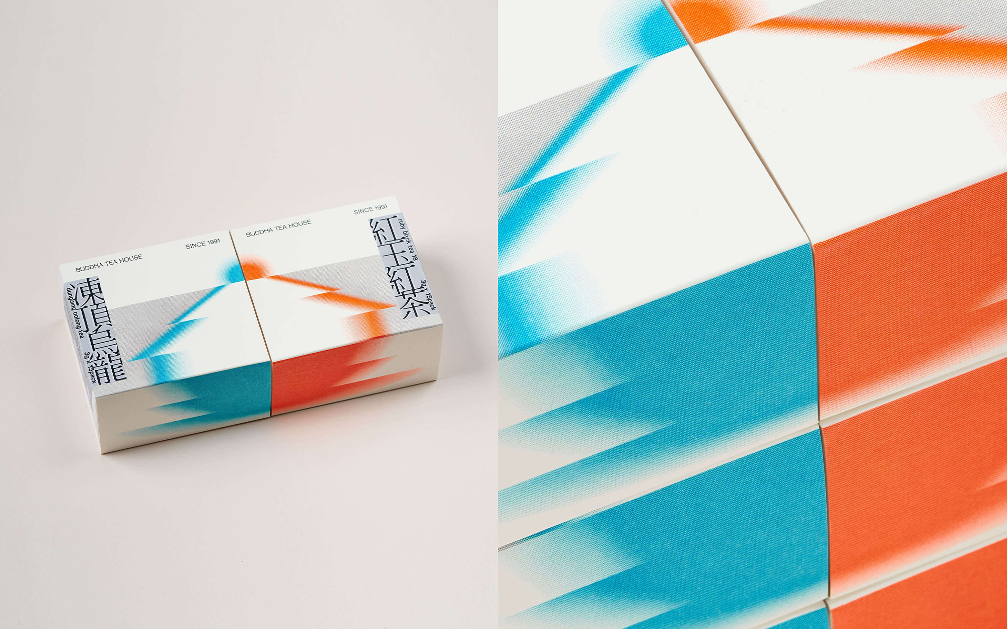
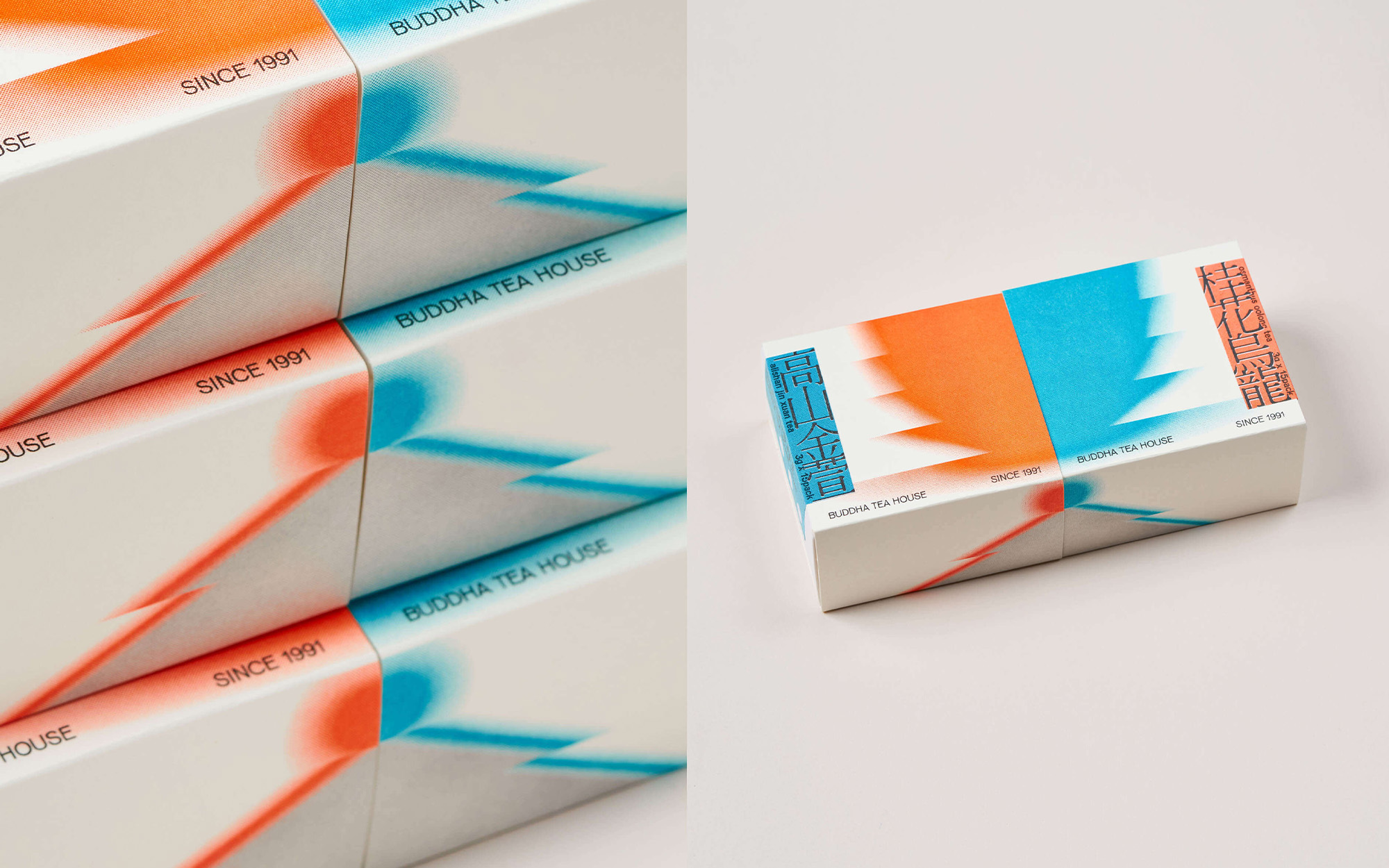


The Buddha Tea House is a family-run tea house and shop in Taipei, Taiwan. The family’s secret method of roasting is well-known in the tea community of older generations, but lacks a younger audience. The gift box is a new product they are launching aimed at younger consumers in hopes of breaking into a younger demographic. I decided to work in the direction towards minimally vibrant colours and meditative gradients to highlight the sense of passing time and ritual to the tea-drinking experience. The resulting packaging and visual design is modular. Individually, the boxes form a sunset or a cup and saucer. When pieced together, they form a traditional chinese Gaiwan tea cup.
All inner packaging is riso-printed at O.OO in Taipei, Taiwan.
Winner of the 2021 Golden Pin Award in the Packaging category.
All inner packaging is riso-printed at O.OO in Taipei, Taiwan.
Winner of the 2021 Golden Pin Award in the Packaging category.
︎ Role: Art Direction, Graphic Design (Jr.), Print
︎ Client: Buddha Tea House
︎ created at: O.OO
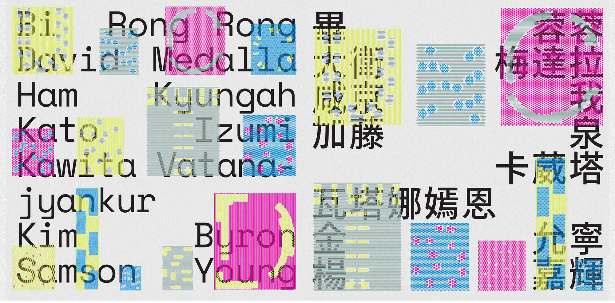
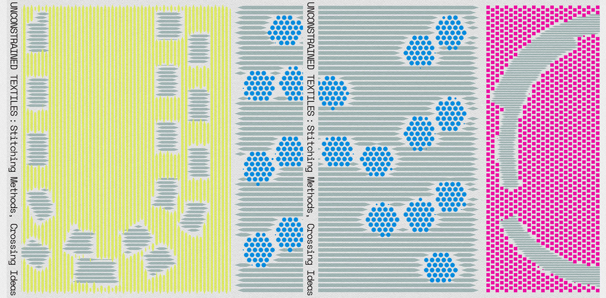
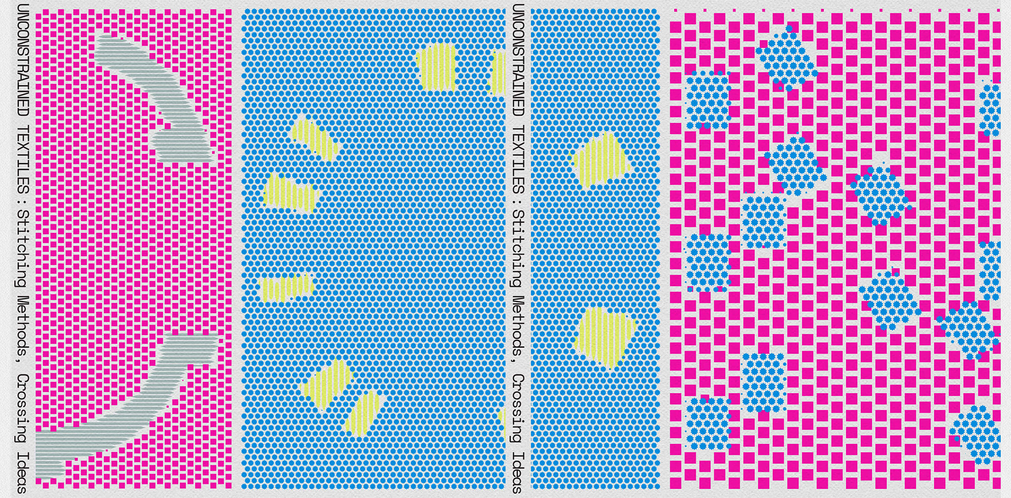
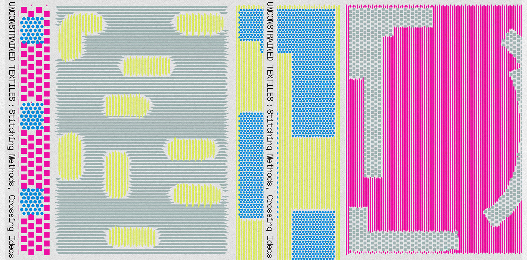
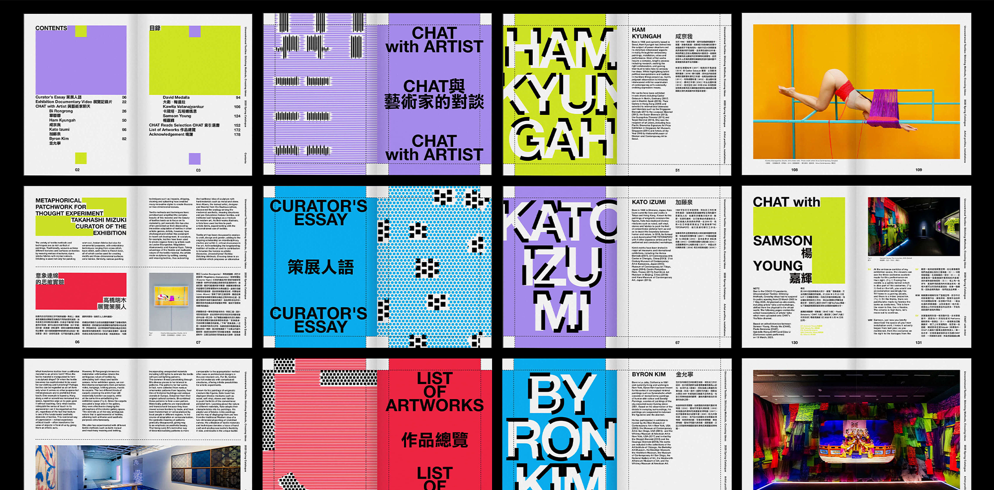
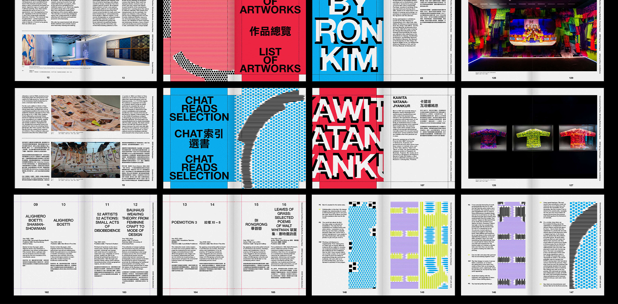
The Center for Heritage Arts & Textile, or CHAT mill6, is a fine arts museum in Hong Kong. Their 2020 spring exhibition “Unconstrained Textiles: Stitching Methods, Crossing Ideas” brings together the textile works of 7 artists of different countries and cultures. However, due to complications from the COVID-19 pandemic, they have recently collected and put together information and photos on the exhibition together to create a designed documentation of the exhibition.
Working with the Art Director, I worked with the idea of patchwork and irregular shapes when designing the layout of the catalog. The content is written in Chinese and English, so I also worked with bilingual typography and layout when designing spreads.
Working with the Art Director, I worked with the idea of patchwork and irregular shapes when designing the layout of the catalog. The content is written in Chinese and English, so I also worked with bilingual typography and layout when designing spreads.
︎ Role: Editorial Design (Jr. Designer)
︎ Client: Center for Heritage Arts & Textile
︎ created at: O.OO
Nike JORDAN
Graphic Design
2020

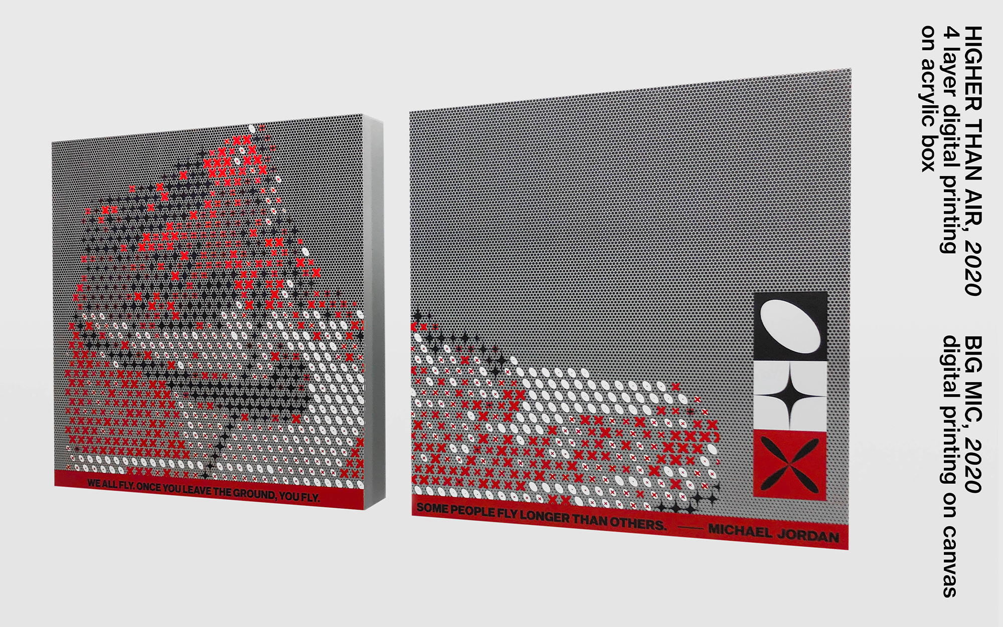
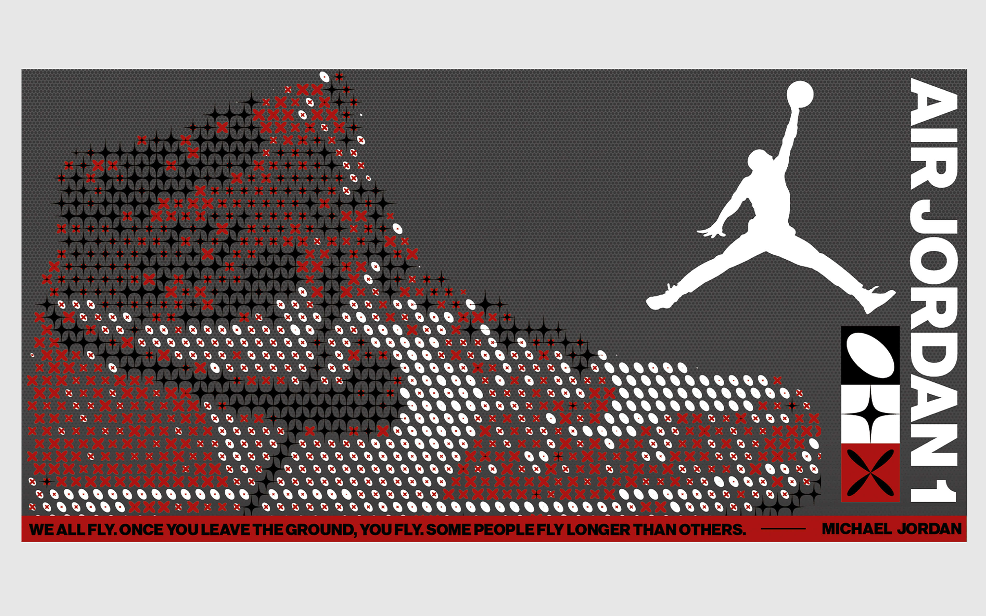
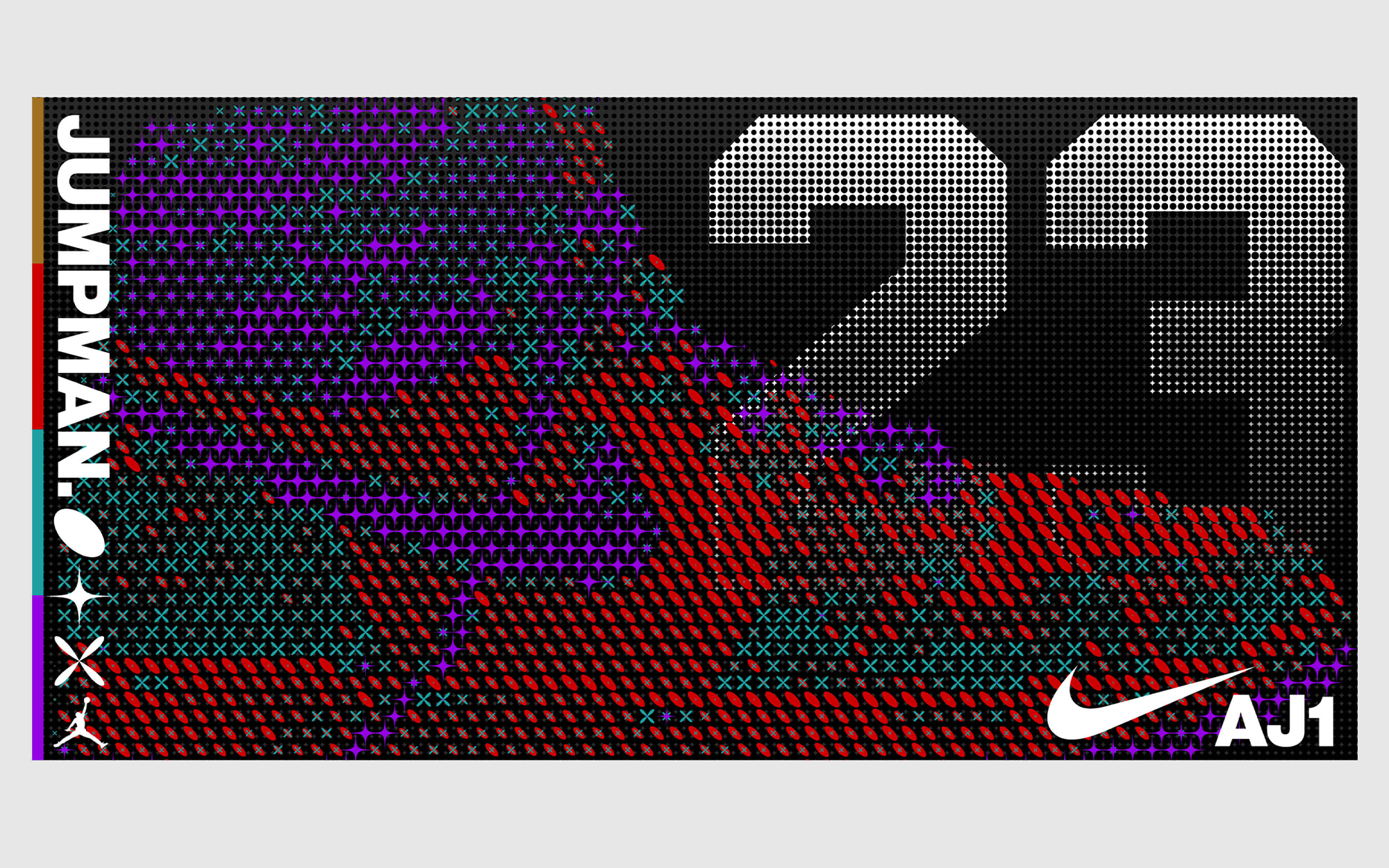
For the new JORDAN 301 concept store in Taichung, Taiwan, O.OO was invited as one of 3 artists to create pieces for the in-store space. For this collaboration, we made two pieces: BIG MIC and HIGHER THAN AIR. Each piece uses elements of JORDAN and the AJ-1.
Together with the Art Director, I worked on the BIG MIC wall graphic, testing different raster patterns and overlays and how they interact with the gold, red, and silver.
Together with the Art Director, I worked on the BIG MIC wall graphic, testing different raster patterns and overlays and how they interact with the gold, red, and silver.
︎ Role: Graphic Design (Jr.) - BIG MIC
︎ Client: Nike JORDAN
︎ created at: O.OO
Wework Shanghai
Graphic Design
2017
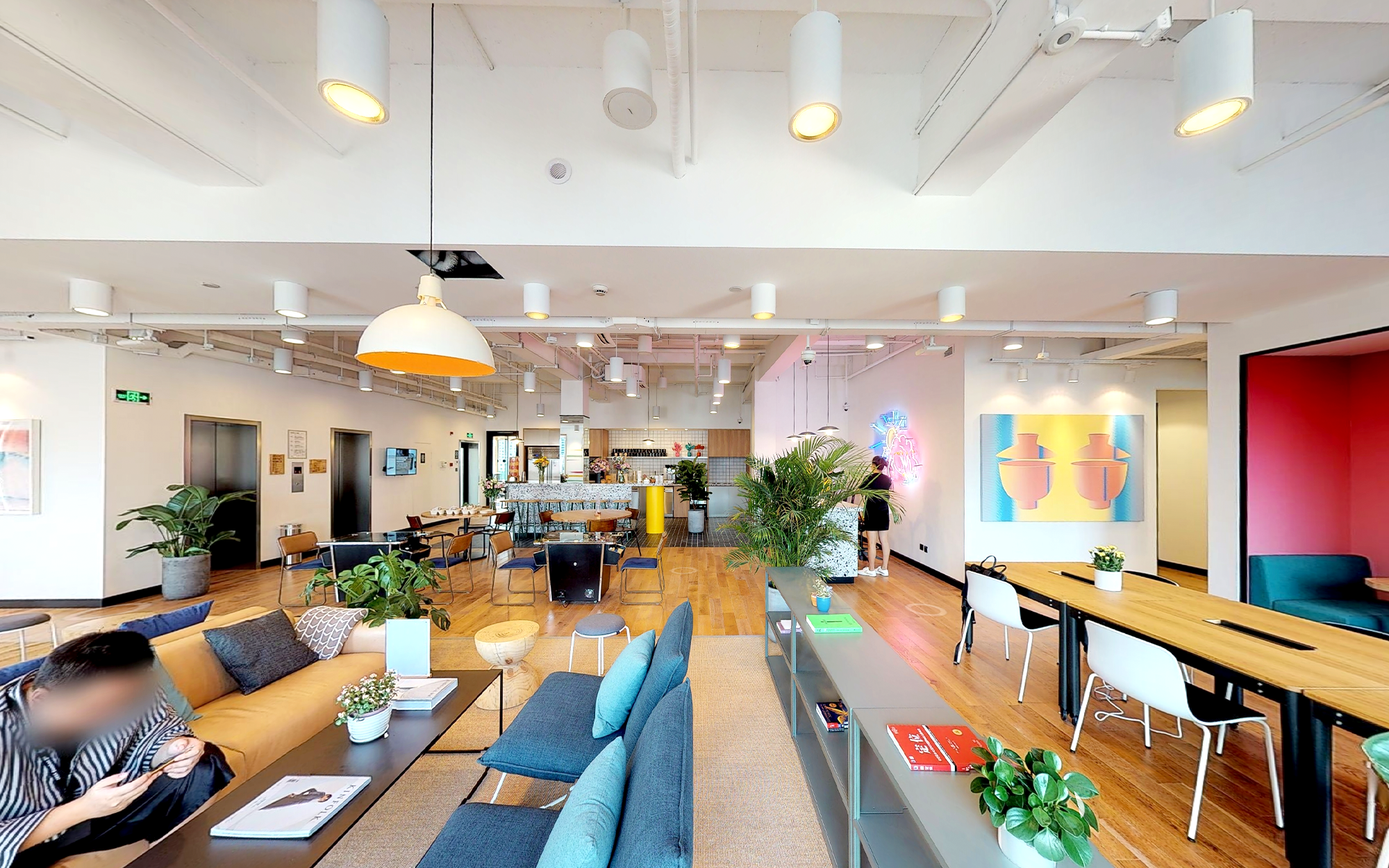
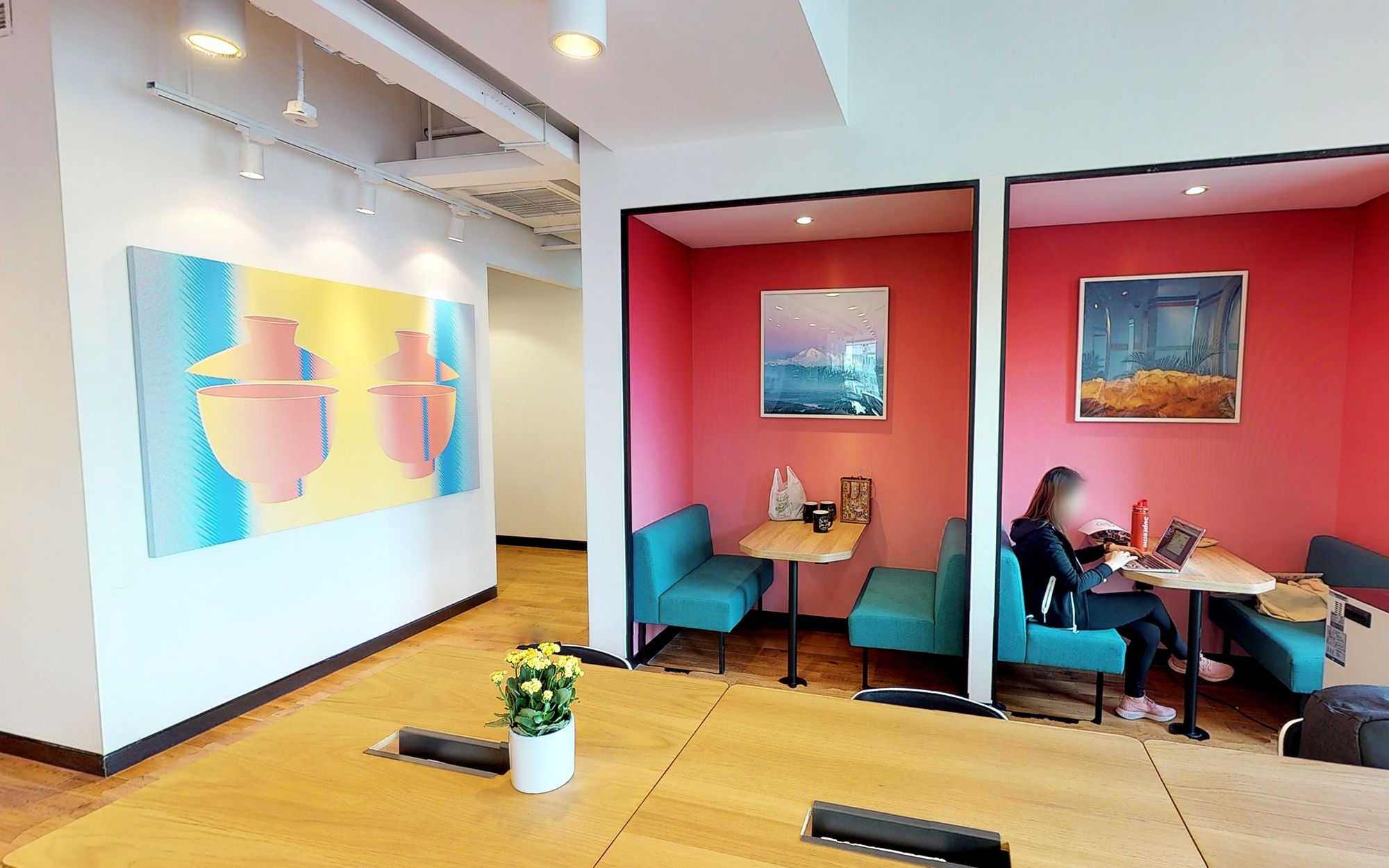
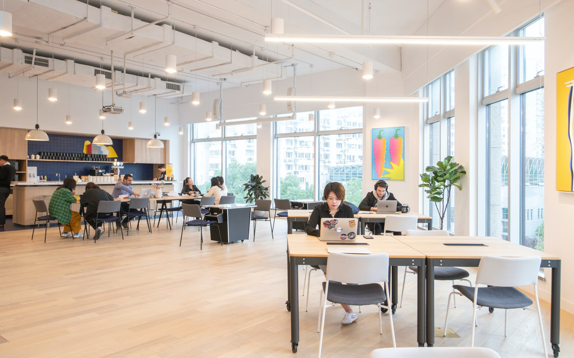


Wework contacted us for design assets to go in their numerous co-working locations in Shanghai, China. Inspired by the bustling local supermarkets and vibrant vegetables and produce, I created a set of graphics for use in their office at 363 Changping Lu.
︎ Role: Graphic Design
︎ Client: Wework Shanghai
︎ created at: O.OO